
Inspiration for colour schemes? Again? You’re right, we do already have quite a few posts on this topic already (see e.g. the Mopani worm or wildlife picture posts). Anyway, here I go again… (I just love it ! 🙂 )
A recent project exercise asked me to do the following: Take one of your favourite pieces of artwork and use its colour scheme to design a space of your choice. This exercise was actually more interesting than I assumed at first. Why? Because I did not only end up borrowing the colour scheme, but actually ended up trying to capture the emotional value of the painting as well in the room I “created”. This was an unintended consequence, but a nice surprise, and worth sharing.
Franz Marc (1880-1916) was a German expressionist painter. Together with other famous artists of his time – among them Wassily Kandinsky, August Macke, Lyonel Feininger, Paul Klee, Gabriele Muenster and others – he founded the loosely connected organisation of artists, the Blue Rider (der “Blaue Reiter”), with the goal to foster the acceptance of abstract art.
Most of Marc’s work revolved around animals, which he painted in highly vivid colors in a cubistic style. In doing so he followed his own colour philosophy, in which he tried to capture how he envisioned the animals would have perceived their surroundings and themselves.
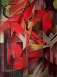
Franz Marc: The Fox, 1913
“The Fox”, painted in 1913, is, probably one of his most famous works, and in my opinion also one of his most beautiful ones. The colour scheme is primarily complementary (red and green), but “embedded” in a series of neutral tones ranging from plain white, to shades of brown, to black. In “The Fox”, colour, motive and composition work together to project a protective and peaceful atmosphere: The fox seems to be hiding in the deepest and darkest parts of the thicket; the perfect place for him to safely come to rest after an eventful day out in the open.
In using Marc’s painting as a reference for the design of a living room, I not only tried to borrow the colour scheme, but also wanted to recreate the overall vibes of the painting. As star designer John Saladino would put it, I intended to “create an environment of an alternate reality with compelling emotional force …”
My “Fox” inspired interior
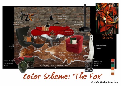
Mood board – Living Room
I used a combination of dark wood for the flooring, dark natural (stacked) stone for the wall covering (! accent wall), and cowhides in a lighter tone (cognac) to “create” an inviting and accommodating backdrop – the equivalent of the forest’s protecting undergrowth, if you will.
I then added the main colour – Marc’s beautiful warm “fox red”, by including two larger pieces of bright red furniture: a sofa and a swivel chair. They are without doubt the focal points of the room – just the same as the fox is in Marc’s painting. As the use of red can easily overpower, however, I was careful not to overuse it. For this reason I completed the furniture selection with a number of black elements to add contrast and help relieve the eye. Among other things, I added a black egg chair, a Noguchi table with a black base, Tom Dixon Beats lamps and a suspended fireplace finished in black metal.
Initially, I planned to include a dark green chair (instead of a black one) to account for Marc’s use of “green”. I quickly backtracked, however, when I realised that it ruined the peacefulness of the space: believe it or not, there was out of a sudden “too much going on” as the green of the chair competed with the red of the other seating furniture. Since the red needed to be balanced, however, I opted for smaller pops of green colour instead – which was easy to do with the help of pillow cases and other selected accessories. If you look back at Marc’s painting, you will notice that he actually does the same: green is used only sparingly there – and this despite the fact that the whole scene is set in the depth of a deep forest!
The orange in Marc’s painting is represented in my colour scheme in the same form as the green – very subtly in pillow cases and art; again to avoid any competition with the red sofa and chair. A number of white highlights (floor lamp, the side of the cowhides, a pillow case) break up the darker colours without disturbing the overall atmosphere and colour scheme.
Finally, apart from making use of Marc’s colour scheme, I also tried to reflect his cubistic painting style in the selection of the furniture of the place. The floor lamp’s “origami” shape, the triangular metal lattice work of the stool, and the triangular shape of the Noguchi table are subtle nods to Marc’s signature use of triangular shapes.
You may want to try this for yourself … instead of buying art after you have designed and furnished your room, turn the process on its head and let yourself be inspired by a piece of art you truly love. You don’t have to own it (though I wished I did!), but regardless, you may be able to capture its beauty and emotional power and in the end succeed in making it your own.
Happy Easter!


Pingback: Use your favourite art to inspire your design | Inspire Tips·
Fantastic use of the elements of a spectacular painting. Truly unique 🙂
LikeLike
Thank you! Glad you like it. It was real fun to do!
LikeLike