
Have you ever wondered why we can easily say “oh, that’s a great design! I like it!” or why we may quickly reject another?
In a recent TED talk, graphic designer and successful book cover designer Chip Kidd spoke at length about how he distinguishes good from bad designs. He argued that good design is often clear. Clarity signals sincerity and honesty, it is something easy to grasp. So that is good. But – he continued – not all good design has to be clear. In fact, oftentimes good designs are everything but clear: they are shrouded in mystery and complicated, demanding to be decoded and “want to be read”. In short, good designs do not have to be clear, good designs can also be mysterious.
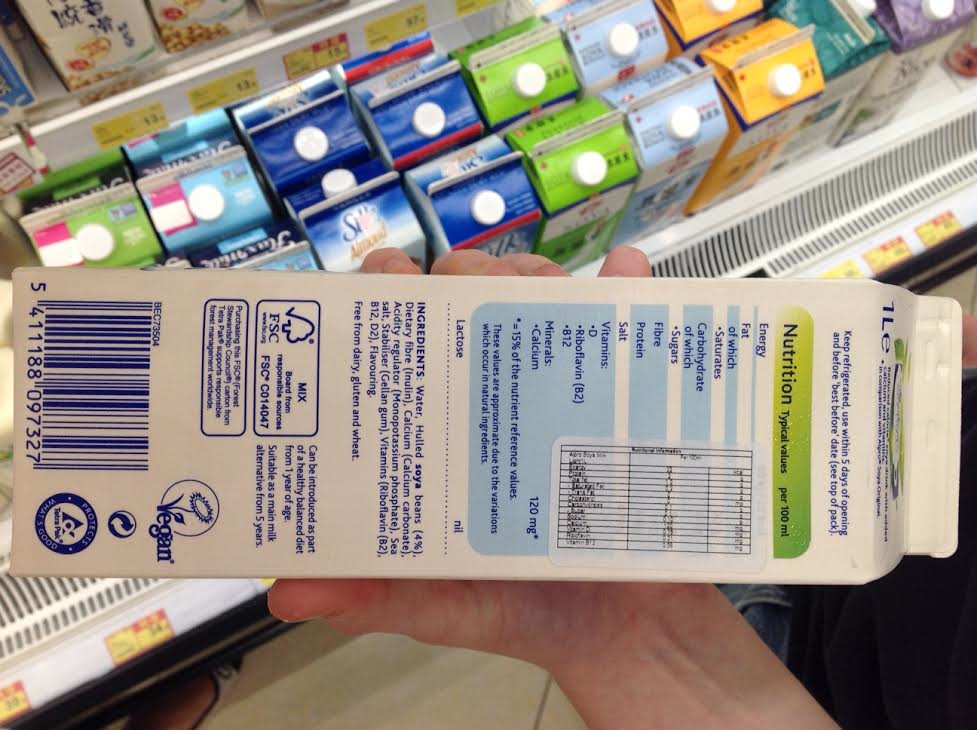
Unusefully clear: Soy milk container with “clarifying” nutritional information added by the HK government.
So, if good design can either be clear or mysterious … where does that leave us? Answering this question, Kidd adds an additional parameter to his analysis: USEFULNESS. Good design can be clear, but the clarity of the design should be a useful one. In the picture to the left, you see an example for unuseful clarity. Some years ago, the HK government made it its mission to “improve” on the nutrition labels provided by foreign manufacturers and started slapping their own information on food containers; exactly the same nutritional information as can be found on the box itself but in smaller print and in an uglier, industrially clear format. Now, my eyesight is not particularly good, but I guess this kind of labelling will be a challenge to almost anyone. The information on it is so tiny, you can’t read it – let alone the original information behind the label (which – funnily enough -is exactly the same, except in its case a number of graphic designers probably spent hours making it as legible and visually appealing as possible). Unuseful clarity at its best!
Similar reasoning holds for mysterious design. If the mystery inherent in a design is useful, it has the potential to be good. If it confuses, it probably rather belongs into the bin. I found Kidd’s categories pretty intriguing as they can be easily applied to interior design. Below I have compiled a few examples for each of the four categories: useful clarity and mystery, and their two unuseful counterparts.
To start, let’s take a quick look at the first category: useful clarity.
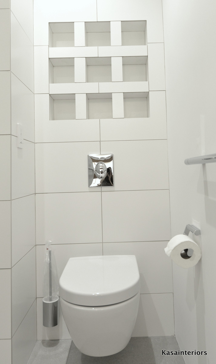
The cubby holes above the toilet hold toilet paper. The owner of this place needs to stock up on it soon!
When we enter a house or apartment and have no problem in finding our way around, that is, if we intuitively know where the powder room or the kitchen is, we are likely to be satisfied with the design of the place. Objects and rooms are where they are expected to be. No further questions need to be asked: anyone who enters the place finds his or her way around without any problems. Brilliant! Good lighting is another area where great design is rooted in useful clarity. In his book “The Architecture of Light” Sage Russell suggests to go about lighting design in 5 steps. The first one being: “use light to create goals, paths and destinations to encourage flow and movement”. In other words, before all else, good lighting design should aim to add clarity to the overall architecture of a place so that the layout becomes self-explanatory. A third example I recently encountered are instructions commonly found on the shiny surfaces of inductive cooktops. I recently bought one of those, but being averse to reading boring operating instructions, I actually avoided using the cooktop for the first couple of days. (As I don’t spend much time in the kitchen anyways, I didn’t find this procrastination particularly difficult!). Unfortunately, when my family began incessantly begging me for some actual food in place of the cup noodles we’d been living off for the past week or so, I gave in and paid some attention to the symbols on the cooktop before turning to the dreaded manual.. I was positively surprised: one glance at the symbols on the cooktop was sufficient to figure out how the whole thing worked. What a fantastic experience: clear and straightforward – that’s good design, no doubt!
What about useful mystery then?
According to Kidd, useful mystery gives the user credit for knowledge he already has. In other words, useful mystery engages and motivates to figure out what is behind a particular design. Frank Lloyd Wright kept entrance halls generally low, only to offer a glimpse of “something much, much bigger” a little bit later on (in architectural jargon: he made ample use of the principle of “compression and release”). Entering a FLW house, one knows this and is immediately intrigued and motivated to explore the space further. Mirrors are another powerful tool in creating useful mystery. Have you, for example, ever seen mirrors used as toe kicks in kitchen cabinetry? The effect is stunning. The cabinetry appears to “hover” above the ground as the kitchen flooring visually extends beyond under the cabinetry. Awesome. For more ideas, on how mirrors add useful mystery, click here.
Turning now to the unuseful portion of our continuum, let’s explore some examples of unuseful clarity.
What about all those ‘cute little signs’ in neighbours’ home that tell you where the bathroom door is? Most of us will agree that while pinning up those signs is downright logical and thus excellent in a public space (in that case, they actually add clarity), it is entirely unnecessary in a private residence. Personally, I tend to find it rather kitsch, but quirky nonetheless. Another example are house designs that permit literally everyone to look into your living or bedroom, especially when the house borders on a public thoroughfare such as a street. I am sure there is a better way of resolving the conflict between “cool design” and privacy? Why do people need to overshare? (For some famous examples, just take a look at Mies van der Rohe’s Farnsworth House or Johnson’s Glass House). It must be hard to live with all that clarity and feel comfortable.
Similar to unuseful clarity, unuseful mystery is also something we can do without.
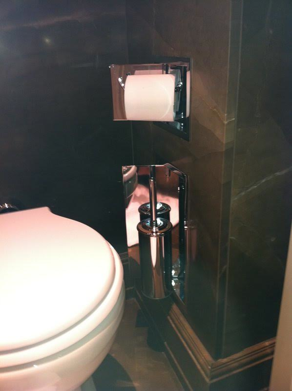
Where is the toilet paper? This design surely stroke me as mysterious when I entered the bathroom. But is it useful?
As a result of bad design that is rooted in unuseful mystery, things get messed up, time is wasted or we feel utterly lost. Some examples: our newly built house contains dozens of light fittings, and equally haphazard circuitry to go. Great. Unfortunately, to operate all those electrical circuits, we also required a fair number of light switches. Despite the fact that – in theory – everything was well thought out (we went through 7 iterations!), our electrician took things into his own hands and began wiring mystery into our circuit design. Now we have to memorise by heart which switch operates which lights, since there doesn’t appear to be any rhyme or reason behind the switch arrangements (probably makes perfect sense to the electrician though… maybe we just haven’t figured out the key). Another example of unuseful mystery are seemingly empty rooms. Upon walking into one, I tend to ask myself, ‘where is everything?’ The clutterless look must appeal to minimalists, and admittedly I too appreciate clean designs, but the majority of people are less than happy about overly minimalistic schemes – the eye is drawn to detail, and if there is nothing to look at, one may end up at a loss as to what the actual point of the design is. Another fun example is the little game of trying to figure where to turn off that table/night stand lamp when you are very tired. If it’s fully integrated into the lamp, this deceptively simple task immediately becomes a full blown adventure quest: The overall design of the “Mr n” table lamp is amazingly sleek (I do love it so), but this sleekness comes at a fiddly price. Lastly, the unuseful mystery that annoys me again and again and thus deserves mentioning: elusive soap dispensers in public washrooms. You know it’s there, but you simply can’t find it. I tend to feel rather ridiculous when I end up sheepishly washing my hands with water alone, after having spent five minutes running my hands along the undersides of the mirrors in desperate search of soap …
In sum, design is good when it’s clear and useful. It is also good (maybe even better as it adds interest) when it harbours some useful mystery. In other words, all of this suggests that we simply need to learn to stay away from the unuseful “cousins” of both. … If it only were so simple! In a recent article in the Financial Times Edwin Heathcote tries to solve the mystery of why so many unuseful (or dysfunctional) designs are regarded as “desirable” … check it out!
