
Hello, it’s Tasha again (writing posts is really fun, also I’m confronted daily with art challenges and little siblings and… well, you’ll see anyhow) and my mom has, once again, commissioned me to write a text for her blog.
First things first: I feel like I should give some context for this post. My sister’s tooth recently fell out, and she’s now running around proudly presenting everyone who will listen, and some who won’t, with the Tooth. Her smile now has two large gaps in it, on either side of the two upper incisors at the front of her mouth. To say the least, her attempts at whistling through them are hilarious, and also got me thinking.
For designing things is not necessarily about stuffing a room full of furniture. Sometimes, as Mies van der Rohe famously said, less really is more. In fact, an entire branch of interior design has evolved around the concept. Starting with the Bauhaus movement during the years of the Weimar Republic (i.e. between WWI and Hitler’s rise to power), it has grown to be one of the most desirable forms of design, also here in HK.
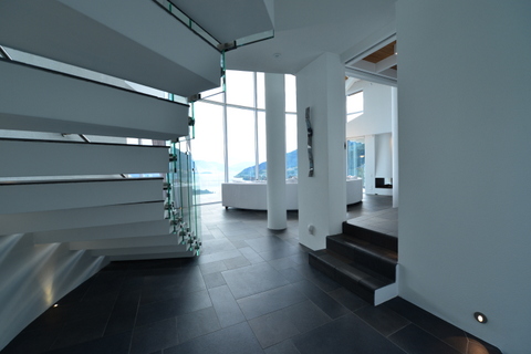
Light filtering in through the negative space between the cantilevered steps forming geometric patterns of light and shadow
In Hong Kong, everything indoors is white, and everything outdoors is chrome and glass (at least, for those who have the money). This has a good reason: many Hong Kong Chinese, as with many other East-Asian cultures, have an appreciation for space, cleanliness, and order. (Europeans, on the contrary, tend to prefer cluttered homes framed by wood and quaint windows.) White walls reflect all natural light cast into a room, and are, at least during the day, as important a feature in the architecture of light as pendants and light fittings.
Though I can only give a very broad impression of the minimalist style, not being officially trained in the matter myself (though I’ve gotten quite a few lectures on the subject from my mom… come to think of it, she gives me a lot of lectures on interior design. Hmph. Not that I seem to retain all that much :’) I’ll do my best to give a brief introduction.
Minimalism is based around a few key concepts: Neutral colours, no clutter, clean, white… you know the type. It’s those rooms you walk into that feel like they would be sterile if even a little bit more unfurnished, and are curiously inviting nonetheless. White, unadorned walls are merely one of many features of minimalism: they serve as a neutral background to the furniture. The furniture itself is often taken from mid-century modern, or simply modern designs (such as Eileen Grey side-tables, Noguchi tables, Barcelona chairs – most of which were designed around the 1930s) and comes in mostly neutral colours, as well. Those (rather boring) colours (let’s be real here) are set off by carefully selected ‘accent colours’. These might come in any form – plants, pillows, a single chair, etc.
In terms of furniture, the phrase “less is more” truly comes into its own. If you can fill up a space by using the minimum in resources and furniture items, you can be congratulated on being an excellent minimalist decorator. Generally, the rule of thumb is ‘only keep the essentials’.
Now, you might be wondering why mid-century modern is, both here and in many other sources, so commonly associated with the minimalist style. There’s a rather simple explanation to that conundrum: after the world wars, people had limited materials with which to create furniture and houses. Therefore designers such as Marcel Breuer looked for alternatives to the traditionally plush sofas – ones which used the minimum of metal, stuffing, fabric and leather. They came up with contemporary designs which are still revered as the pinnacle of the modern aesthetic today: black leather chairs with tubular metal fittings (all that shiny metal stuff), which would have seemed filigree at the time, but are as comfortable as any traditional couch.
You can also see minimalist elements in many websites as well: this one, for example, uses a theme with a plain white background and an open font (that is, without serifs, or fancy adornments like you would see in Times New Roman). The theory is that it is therefore easy to read, that the photos stand out better (they would then act as a rather disorderly set of accent colours, drawing ones attention to the posts), and that the website overall is more attractive to visit.
You can make your own mind up over whether that works or not, but personally I’ve always found minimalist styles absolutely beautiful, not to mention an art in and of themselves.
Namárie,
Tasha

