
Happy New Year to all! I hope all of you had a most relaxing holiday season and a good start into 2016.
I for my part just returned from a wonderful safari that brought us both to South Africa and Tanzania. Since I never venture out in a jeep without my camera, I had the opportunity to take hundreds of pictures during the daily game drives. Aside from “freezing” the observed animal action in all conceivable ways, I managed to take a number of shots featuring rather interesting color combinations – which got me thinking … why not use these pictures as inspiration for interior colour schemes?
Here is what I found …
Sunrise over Lake Manyara: an analogous scheme
We had to get up even earlier than usual to witness the sun rise over Lake Manyara. But rest assured, it was worth it. Lake Manyara is absolutely gorgeous no matter when you arrive during the day, but watching the sun rise above the lake is an unforgettable spectacle.
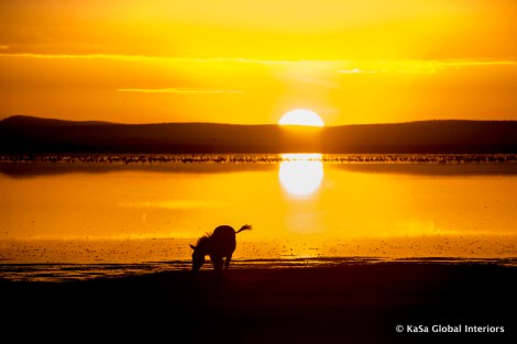
Lake Manyara is located in Tanzania and (together with Lake Natron) known for its huge population of Lesser Flamingoes (these are the ones that turn pink when they feed on red algae – Greater Flamingoes stay obstinately white). Interestingly, it is very shallow – about a meter deep – thus the birds can walk about easily even when far away from the shoreline. On the picture, the flamingoes appear as blackish dots in the middle of the lake.
The picture’s main colours range from orange to yellow: orange, yellow-orange, orange-yellow, and yellow. Together these hues form a harmonious or analogous color scheme, which is comprised of three to five adjacent hues on an 18 hue color wheel (or up to 7 on a 24 hues on a color wheel, respectively). Personally, I can easily imagine a room with white walls and ceilings furnished with black leather sofas or chairs where pillow cases, art, flowers or even an accent wall in warm orange and yellow tones add an exciting notion of color.
If orange and black is not for you, what about going “neutral plus” – like the marabou stork?
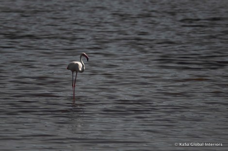
Or the flamingo stalking about in a highly color-desaturated puddle of water?
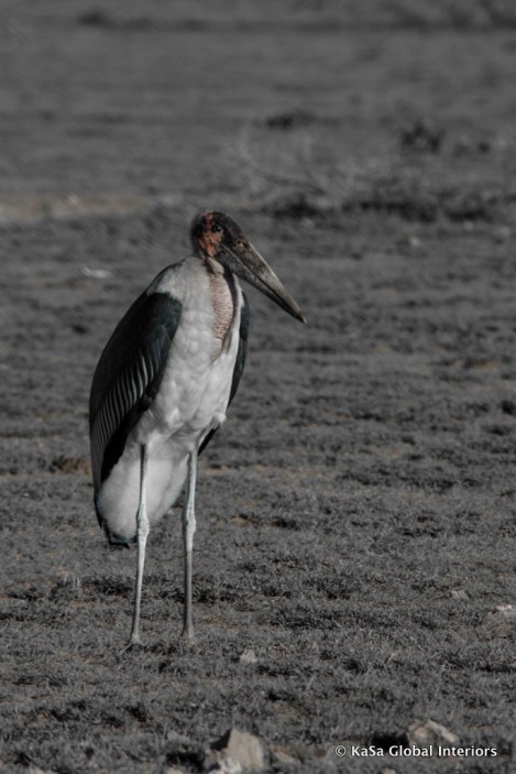
I am partial to white interiors accented by greys and a bit of colour, though somewhat less partial to marabou. This type of colour scheme is easy to pull off and if you don’t overdo the “blacks” or the color, can hardly go wrong. Neutral-plus is a colour scheme that is often used in commercial designs usually built around a palette of greys and accented with brighter colors such as red or yellow. Nonetheless, this scheme works at home as well … pale pink accents will certainly add an elegant, refined touch to your space. (Again, the marabou’s probably beyond that. Their feathers get some credit, though – a gorgeous blue/black that is best appreciated separate from the bird.)
What about “Natural Colours”?
Well, that’s easy. The idea to use colour schemes that you find in nature – and are generally regarded as beautiful, harmonious and satisfying to the eye – is not new. I am including them here regardless, since I have some cool pictures to illustrate the whole thing.
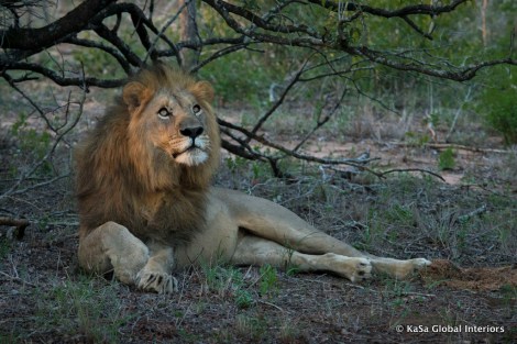

The coats of the cheatah cub and the male lion feature more or less the same colours: a combination of beiges and tans accented with bits of black and white. The natural colour of many building and furnishing materials falls into that group as well: wood, wool, sisal, jute, cotton, bamboo, leather, hides/animal skins, to name but a few. Thus, why not leaving them in their natural state (instead of painting or dyeing them) and adding a few black and white accents to keep the overall scheme crisp and fresh? Natural colour schemes are generally thought to be a safe choice. This said, they can also easily appear boring and drab. Thus, some amount of contrast is definitely needed … So, why not taking a cue from nature to see how it’s done?
Zebra coats do not apply.
Going color crazy – the Red-Headed Amagata Colour Scheme
For those of you, who LOVE colour, this one is for you.
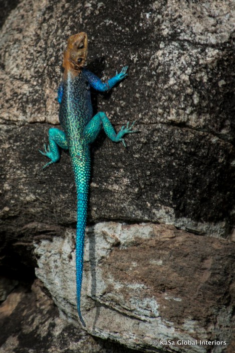
While the amagata’s colour scheme is arguably as “natural” as that of the lion or the cheetah cub, in colour-theoretical terms, we are dealing with a totally different animal. Instead of a natural, harmonious (and potentially boring…) colour scheme, the lizard features a split-complementary one, full of contrast. This scheme consists of one key colour (here a red-orange shade) and the two colours on either side of its complementary: blue and blue-green. To tell the truth, this is probably a fairly challenging scheme to get right, but could potentially yield marvellous results. It will most likely work when used to create colourful accents in an otherwise neutral (hehe… white) interior (just imagine a sofa in those blue/green tones with silk pillow cases in that rusty red?) or may totally wow you when skilfully integrated in a Moroccan or typical Indian interior.
Another contrasting scheme: the Malachite Kingfisher’s complementary-colored plumage.
I just love this bird. Despite the fact that many safari aficionados are passionate about finding the “Big 5” (leopard, lion, buffalo, rhino and elephant), we are getting as much a kick out of sighting one of these gorgeous flying gems. This time I was lucky enough to catch the bird before it flew away (which was by pure luck; as I tried to take pictures of village weavers building their lofty abodes, out of a sudden, my husband shouted out from behind: “Right in front of you – a Malachite!”. Without thinking I simply pressed the release and there it was: fully enclosed by the frame and in focus!
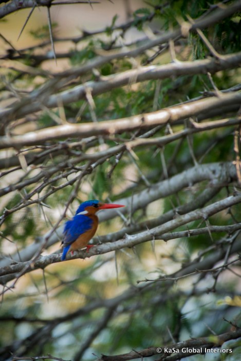
Now take a look at the bird’s blue/violet-blue back which is complemented by a shade of orange reminiscent of cognac. When I looked up both colours on the colour wheel, I was surprised to find that they formed a nearly perfect complementary scheme. Now, how to turn that into a successful interior? Imagine a butterfly chair featuring a cognac-coloured cowhide and throw a bright blue pillow on it … awesome. Or what about a collection of deco pillows in all the colours of Malachite to adorn your bed? Clearly, a piece of artwork in these colours would look fantastic, especially, when it is hung in a room with wooden flooring, white or off-white sofas, and deep-blue pillow cases …
Lastly … and this is just for fun: the flamingo pink/blue-green color scheme.
The sighting is nothing short of breath-taking, and judging from the picture, the colors seem to work well together. Interestingly, I could not find this combination anywhere among the widely accepted color schemes.

While it appears to be complementary, my color wheel showed me clearly, it is not. For this, the blue would have to be yellow-green. Or alternatively, the flamingoes would need to look more red-orange than pink. (Yikes! Though they might suit the analogous sunset colour-scheme better.) Thus, I am a bit at a loss here, when it comes to colour theory. That said, I guess it could still work, e.g. as accents in a neutral environment, as the basic colour scheme in a nursery, or to determine the colour of outdoor soft furnishings around the pool.
For more on colour theory, take a look at John Pile’s “Color in Interior Design” …


I love how you combined the amazing photos in the real world with decorating advice.
LikeLike
I would like to call your attention to the last picture: blue and pink supposed to be the colors of 2016!
Happy New Year!
LikeLike
Hi Iara – thanks for pointing that out. I had totally forgotten about it when writing the post! Here is a link explaining the reasoning behind Pantene’s choice: http://www.pantone.com/color-of-the-year-2016
Sabine
LikeLike
Pingback: Use your favourite art to inspire your design | KaSa Global Interiors·