
Have you ever longed to make your space appear cosier and more intimate? What about your daily agonising over that awful pipework, or the many electrical cables that so prominently run along your walls and ceilings? Or maybe you secretly wish that your home would look much more spacious than it currently does? Not to mention your procrastinated decision about that badly needed focal point that is so obviously missing, but that you never came around adding?
If you answered any of these questions with a strained “Yes, but … “, you are probably not alone. Renovations can be expensive and time consuming. They often mean a lot of hassle – something that can put off even the most committed design freak. This said, even purchasing a new piece of furniture may appear to be a tall order for some. What would you do with the old piece? You can’t throw it away as it’s still functional, can you? And then, would you be able to find something new to replace it that both you and your significant other would like and that’s in your budget? Hell no!
Well, what about a simple, cheap, but highly effective remedy to all those concerns? Sounds like magic? Not necessarily… (though a Harry Potter-esque ceiling would certainly be nice!) Indeed, it can be as simple as applying the right colour.
Not convinced yet? I don’t blame you. Since a picture is worth a thousand words, allow me to demonstrate, with a couple of visual supports, how to use colour to:
- make a room feel cosier and more intimate,
- visually enlarge a room,
- play down or camouflage a negative feature or,
- create emphasis in design.
As the original draft of this post got quite long … (again!) … I have opted for splitting it up into two parts which we will post within a week or so of each other. The first part discusses “colour tricks” 1 and 2, the second one presents 3 and 4.
Use warm colours to create a cosier and more intimate interior
The room design below (Fig 1) was inspired by a Minotti advertisement. In the original, the colours were very different (they used a neutral colour scheme, sticking to grey in all its beautiful variations). What I tried to do here is to show how colour can turn a room from something that resembles an icebox into an inviting, cozy space.
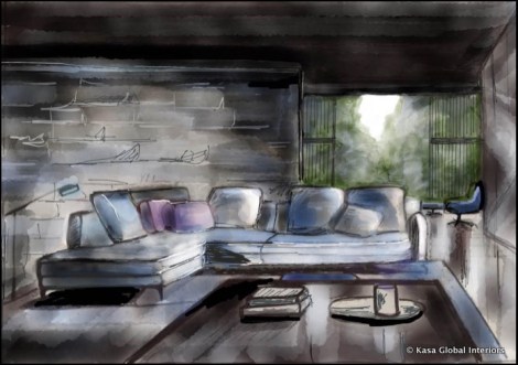
Fig 1: This room feels cold and unintimate
I changed the colour of the soft furnishings from blue to orange/red – a warm color (Fig 2). The carpet’s hue also moved into the warmer spectrum of the colour wheel. Finally, I “changed the light bulb” of the floor lamp. Instead of emanating a rather futuristic, cold blue light, it became a warm, yellowish light source. Done!

Fig 2: Much better: the warm colours of the furniture and lighting help make this room appear comfortable
So instead of throwing out your beloved and oh-so-comfortable sofa with the bathwater, refurbishing it with fabric in a warmer colour and taking out that fluorescent light bulb and replacing it with one that has a softer, yellowish glow aught to suffice.
Alternatively, you can, of course, also change the colour of your walls. If they are currently green or blue … by now you may have an inkling of why it may be making you feel uncomfortable in your space. Even if the blue and green is not obvious, please note that walls painted in a grey with a bluish undertone or white with a cool tint may also contribute to a less intimate atmosphere.
Use white/pale colours to visually enlarge a room
In Fig 3. I have drawn a small bedroom. The black wall at the end of the space and the fairly dark wood paneling to the right and left make the room appear cozy, but smaller than it actually is, as walls and ceiling seem to advance towards the viewer. In other words, the black wall at the end visually “shortens” the room. To a lesser extent, the dark wood paneling on ceiling and walls also “shrink” the room as they visually pull the walls in and the ceiling lower. What to do?
Let’s apply some of the colour tricks here. Remember:
Dark colours advance, pale colours retreat.
Warm colours (red, orange) advance, cool colours (blue, green) retreat.
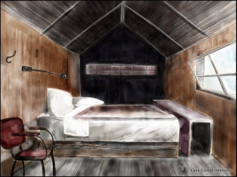
Fig 3: The dark ceiling and walls make this room appear even smaller than it actually is. Comfy, but tiny.
So, how does that help us with our bedroom? Applying the above-mentioned rules, I simply rendered the same space in white.
And voilà!
The same bedroom appears now much bigger and airier (Fig 4). Granted, whether this is a good feature for a bedroom is a matter of preference and taste (I personally prefer the darker, cosier version here), but the colour change definitely did the trick and opened up the space.
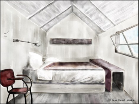
Fig 4: The same small bedroom – in white: it now appears airy and relatively spacious.
How color can camouflage or mitigate a room’s ugly features or can help create a focal point and thus center a room will be discussed in the second part of this post. Stay tuned.


Pingback: Colour – Tricks of the Trade (Part 2) | KaSa Global Interiors·
Pingback: Scale – how to reconcile a big space with human dimensions? | KaSa Global Interiors·