
In the first part of this post we have looked at how colour can be used to make a room feel cosier and more intimate. We also saw how a tiny room can appear much more spacious – just by applying a different colour scheme.
In this second part, I now show you how you can use colour to camouflage or mitigate negative features and create focal points.
How colour can help play down or camouflage a room’s negative features
Basements’ ceilings and walls oftentimes seem to nigh sag beneath the many cables, HVAC ducts, and similar things running along them. All of these could technically be hidden by lowering the ceiling and panelling the walls. The problem with this is that basement ceilings are oftentimes not particularly high to begin with. Thus, what to do if you have to “hide” lots of ducts, pipes, and unsightly beams, but won’t be able lower the ceiling or panel the walls? Again, colour may be the solution. Dark colours, in particular black, help play down and can camouflage a lot of the uglier features of a room. As black is the color that reflects the least light, differences in texture and shape are smoothed over and tend to sink into the shadows. Using a matte finish also tends to help.
Thus, in the example below, I have rendered the entire ceiling black, including everything that hangs on it, from it, and runs through it. If you look carefully, all the detail is still visible, but it does not really bother anybody anymore as it blends in with the rest of it. In other words, the black color camouflages the ceiling’s negative features.
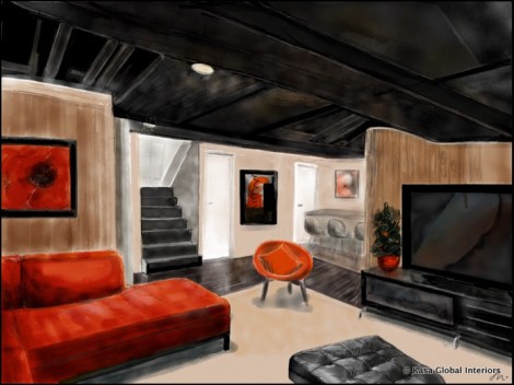
Painting the ceiling black helps camouflage its many eyesores
Use colour to create a focal point
Below I have added a sketch of a small restaurant bar. Here, the emphasis (focal point) is generated by choosing red chairs – instead of, say, grey, white or black ones. The unusual colour of the chairs draws the visitors’ attention towards the bar counter, hopefully enticing them to sit down, take a careful look at the wine menu (blackboard) and order a drink.

The chairs become the focal point of the bar due to their vivid colour
How to apply this idea in your own space? What about painting one wall of your living room in an eye catching (or simply, contrasting) colour creating a so-called accent wall? Or maybe you own a piece of artwork that could add a pop of colour? Of course, you may also just consider refurbishing that beloved sofa of yours and turning it into the indisputable focal point of your space.
Rest assured, you have many options to favourably change your space once working with colour has become part of your design toolset.


Pingback: Colour – Tricks of the Trade (Part 1) | KaSa Global Interiors·